La Cimade: visual identity redesign
Redesign of the logo and visual identity of a French charity defending migrants’ rights: modernising its image while keeping its values of unity and solidarity.
- Design & UX
Context
La Cimade had a strong activist identity, but dated graphics, inconsistent legibility across media and a limited graphic system. The goal: modernise its image without losing what makes it strong.
My role
Full identity design: audit, benchmark, creative directions, logo, brand guidelines and applications.
- Context
- Professional simulation project (SAÉ)
- Team
- Solo
- Period
- January – March 2026
Goals
- Keep the commitment and the human dimension
- Avoid overly institutional graphics and clichéd symbols
- Build a consistent graphic system
Outcome
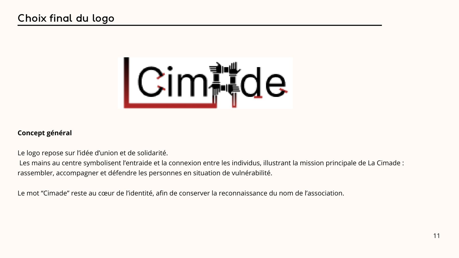
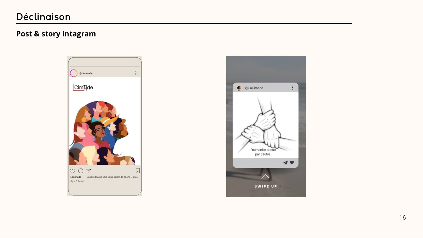
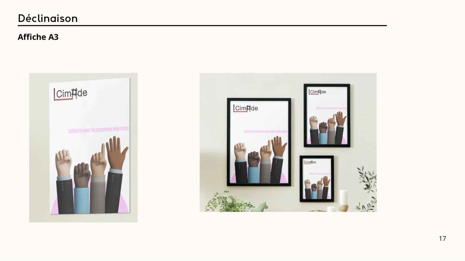
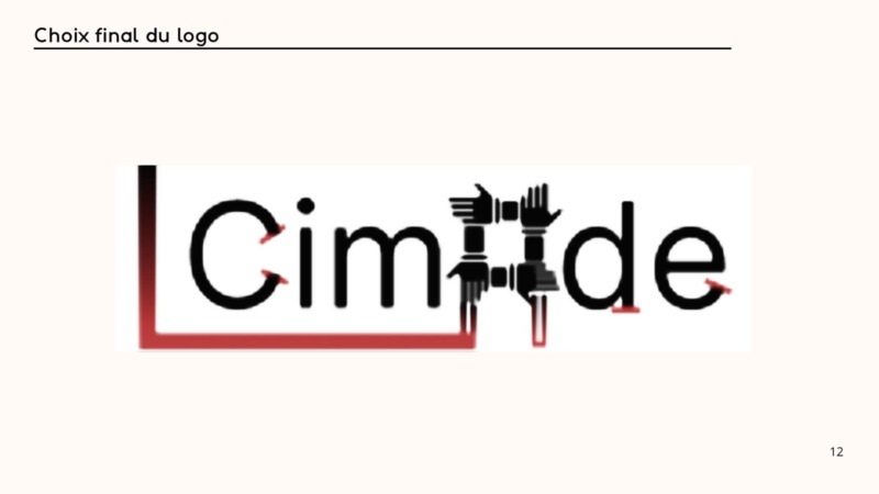
A logo built on the idea of unity (joined hands at the heart of the name) and its brand guidelines, applied to an Instagram post and story, an A3 poster, a web banner and presentation slides.
<under-the-hood />
Under the hood
Design
-
 Figma
-
 Canva
Technical choices
- Red #B22727 for commitment and mobilisation, black for seriousness and stability
- Inter for optimal legibility on every medium
- Legibility tests at small, medium and large sizes, and rules for prohibited uses
Challenges and solutions
-
bug #1
Choosing one direction among several ideas
Cause: Two strong directions: unity and protest
✓ fix Solution: Benchmark, anti-direction and sketches to compare, then unity was chosen
-
bug #2
The hands in the logo became illegible at small sizes
Cause: Too much detail for an avatar or an icon
✓ fix Solution: Simplified shapes and legibility tests at several sizes
Full process
-
Step 1: Audit
Analysis of the existing logo: strengths, weaknesses, colours and typography.
-
Step 2: Benchmark
Study of the identities of France Terre d’Asile and Amnesty International.
-
Step 3: Creative directions
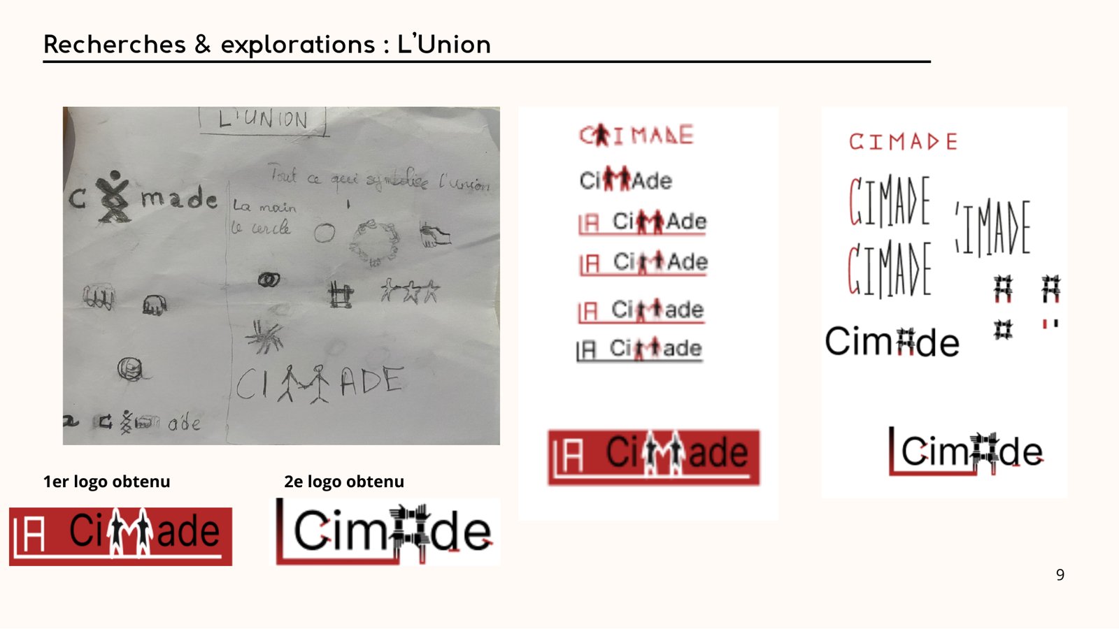
Two directions, Unity and Protest, and an anti-direction: cold institutional communication.
-
Step 4: Research
Hand sketches, then digital explorations.
-
Step 5: Logo and guidelines
Unity direction chosen, final logo, colours, typography, usage rules and applications.